Kanna Fitness
It was here that I gained the strength to embark on this new career journey. Being physically strong is important. Having mental clarity & strength to start over, comes from the confidence that is built in a place like Kanna.
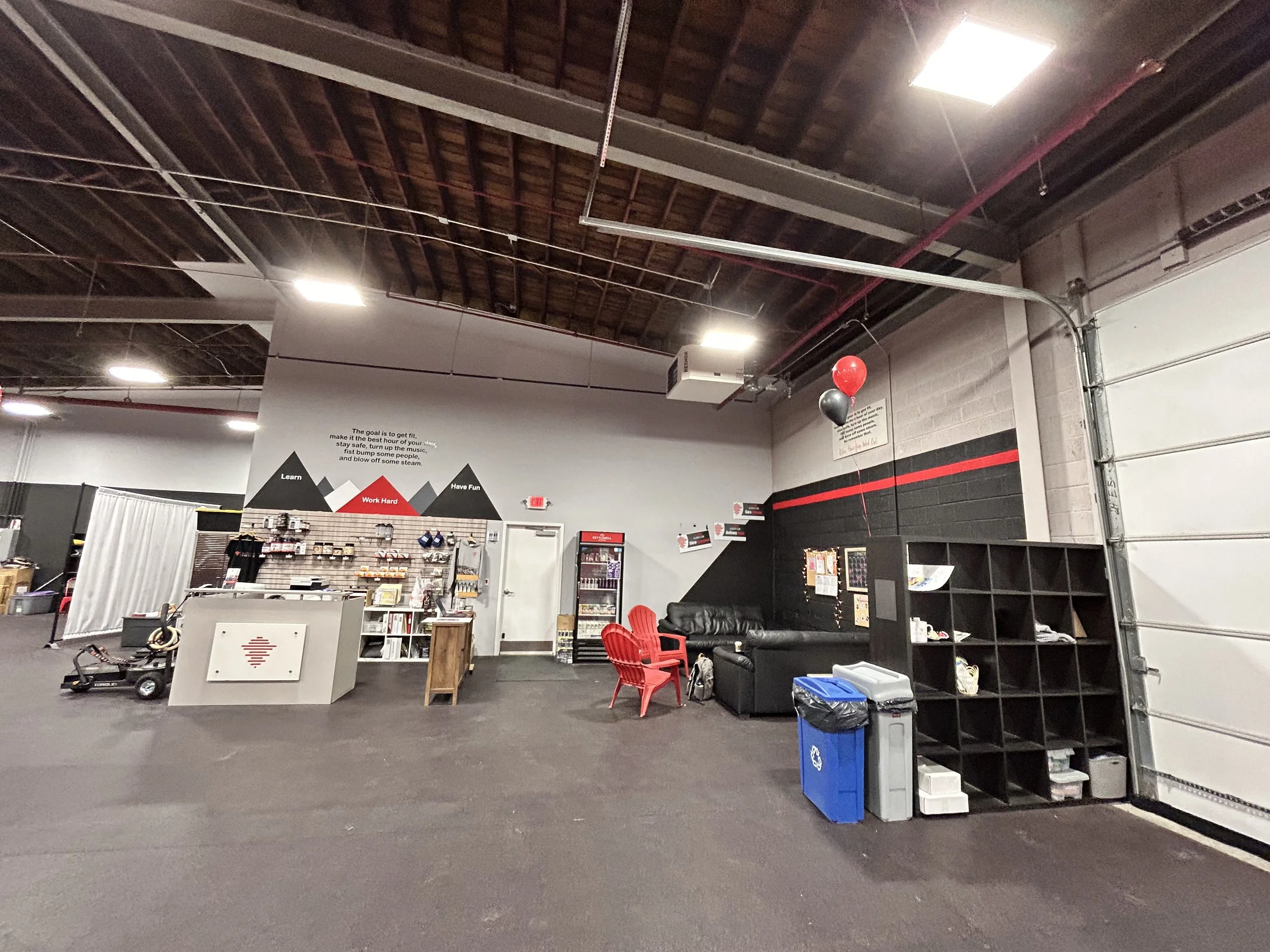
To say that this space was a blank slate is an understatement. Grey concrete walls - yes, yes and more yes! This is a 3,000 square foot space that needed to reflect the vibrant community that it holds. Kanna means “explore” so we explored various ideas before settling on the mountain peaks. The logo is a recognizable one around our town so we made sure to feature it on the largest wall. The motto is reflected throughout it’s members and needed to be prominently featured above the check-in desk. Adding a darker color to the lounge area created a natural nook for members to gather in before and after workouts.

BEFORE

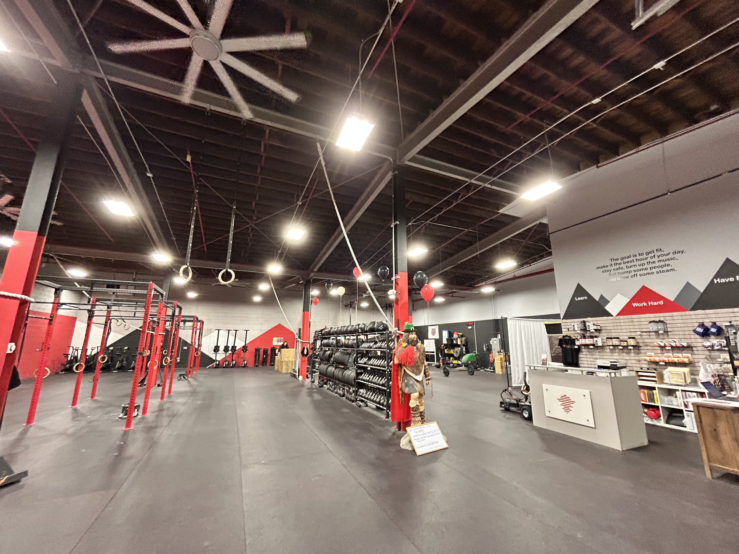


Logo wall


Back wall of gym

Mountain peaks

Member lounge

Member lounge

Black angular wall during a youth session

full view of red wall

Logo wall during a comp

Designed and installed outside sign
Chris P., owner of Kanna Fitness